Originally posted on the Splunk official blog: https://www.splunk.com/en_us/blog/tips-and-tricks/event-calendar-custom-visualization.html
Awhile back, I wrote a blog post about using a custom calendar visualization in Simple XML dashboards. To accomplish this, I used a technique sometimes referred to as escape hatching JavaScript into Simple XML. While this works okay for a developer, the technique does not lend itself well to the end user.
Splunk Custom Visualizations
Splunk 6.4 introduced reusable custom visualizations which allows a developer to package up a visualization and integrate it into Splunk just like the native visualizations. This also addresses the limitation mentioned above – meaning any end user can use the visualization without mucking around with the Simple XML.
So, revisiting the older escape hatch calendar technique, I thought it would be a good exercise to convert the calendar into a custom visualization. The calendar is now available on Splunkbase, and several new features have been added.
Using the Calendar in Splunk
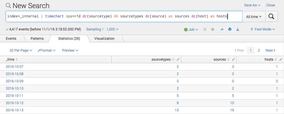
The calendar expects a search exposing _time and a count. The timechart search command does a good job of this. For example, the following search:
index=_internal | timechart span=1d dc(sourcetype) AS sourcetypes dc(source) as sources dc(host) as hosts
produces some nice tabular data like so:
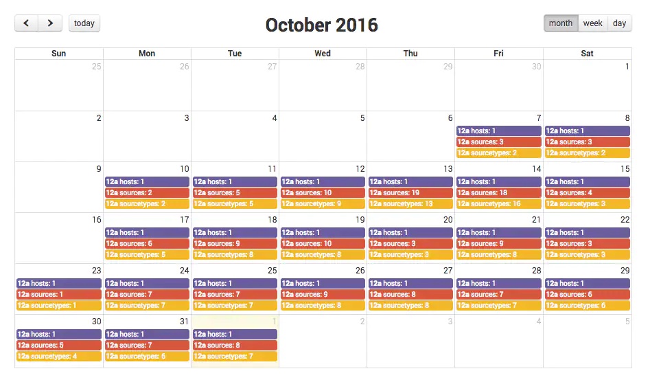
The calendar visualization can take this data and visualize it on a calendar like this:
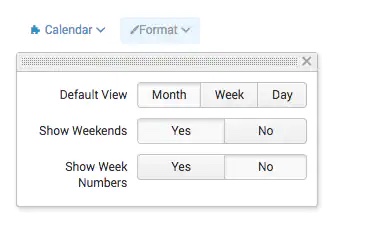
There are some formatting options as well.
Try it out yourself and go download it on Splunkbase.
Special shout-out to the Summer Interns who helped… Yue Kang, Nic Stone, and Phillip Tow!