There are several resources out there explaining how to customize, or brand, Citrix Web Interface. The easiest method I’ve found by far is to modify the layout.ascx user control. Using the technique outlined in this article, you can quickly give your Web Interface site a brand new look and feel.
The layout.ascx user control
The heart of the Web Interface layout is a file called layout.ascx. Layout.ascx is a user control that "constructs" the Web Interface authentication and applications page's HTML. There are two different layout.ascx files for every Web Interface site. These layout.ascx files can be found at path_to_your_wi_site\auth\include (login page) and path_to_your_wi_site\site\include (applications page).
UPDATE: The layout.ascx files in Web Interface 4.6 are located at path_to_your_wi_site\app_data\auth\include (login page) and path_to_your_wi_site\app_data\site\include (applications page).
Cutting layout.ascx to the core
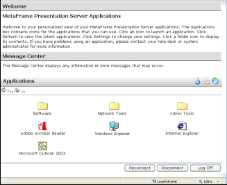
To get started, open up the layout.ascx file located at path_to_your_wi_site\site\include. Next, strip out all the markup and code between the opening and closing <body> tags except the <wi:Welcome runat="server"/>, <wi:MessageCenter>, <wi:Toolbar>, and <asp:PlaceHolder> tags. These tags are the "meat and potatoes" of the Web Interface applications page. The <wi:Welcome runat="server"/> tag displays the welcome message. The <wi:MessageCenter> tag displays the message center. The <wi:Toolbar> tag shows the toolbar holding the refresh, settings, and help buttons. The <asp:PlaceHolder> tag shows all the published applications for the authenticated user.
Note: it is not necessary to use any of these tags in your final markup although it would be pretty silly not to include at least the <asp:PlaceHolder> tag.
The end result should look something like this:<body text="#000000" bgcolor="#FFFFFF" LINK="#000000" VLINK="#000000" ALINK="#000000" topmargin='0' leftmargin='0' marginheight="0" marginwidth="0" onLoad="onLoadLayout();" dir="<%=getString("TextDirection", currentLocale)%>">
<wi:Welcome runat="server"/>
<wi:MessageCenter runat="server"/>
<wi:Toolbar runat="server"/>
<asp:PlaceHolder id="ViewPlaceHolder" runat="server" />
</body>
This produces a "bare bones" Web Interface page. Check it out:
 Click to enlarge
If you would like a copy of this "bare bones" layout.ascx file, you can download it below: layout_40.zip (for Web Interface 4.0)
  layout_42.zip (for Web Interface 4.2)
  layout_46.zip (for Web Interface 4.6)
Giving layout.ascx a facelift
Now, start adding your markup to the layout.ascx file and place the above mentioned tags where you want. If you want to modify text and color properties of the application links, the easiest place to do that would be the style.inc file located in the same place as the layout.ascx file. You can use this same technique for the layout.ascx file located at path_to_your_wi_site\auth\include to customize the login page.
Note: if you need to grab the username and password of the authenticated user, check out this article for instructions on how to do it.
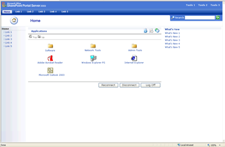
Using the method described in this article, I made Citrix Web Interface look and feel like Microsoft SharePoint Portal Server 2003. Check it out below: 
 Click to enlarge
You may ask yourself, "Why would I ever want to do this?". Well, in this case the company was migrating from a custom written Intranet portal to Microsoft Office SharePoint Portal Server 2003 at the same time they were migrating from Citrix MetaFrame XP to Citrix Presentation Server 4.0. The SharePoint migration would take place after the PS4 migration. So, to minimize end-user impact, the custom portal was replaced with this SharePoint "fake-out". When the portal migration was ready, the front end never really looked that different to the end user, but the back end was vastly different.
If you would like a copy of the templates I used to make Web Interface look and feel like SharePoint, you can download them here
.