I get to do a lot of cool things at Splunk. One of the things I have been wanting to do is incorporate the visualizations I built a long time ago for Web Interface for Resource Manger in Splunk applications. All of those past visualizations were built using Microsoft ASP.NET and Flash. So, I have had to use alternate methods to accomplish what I want.
Calendar Visualization
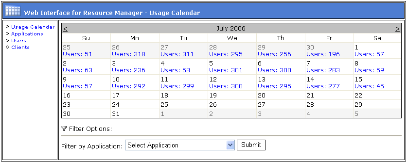
One of the first things I tackled was the calendar visualization that shows how many users log in each day in a month. Here is the old calendar from WIRM:
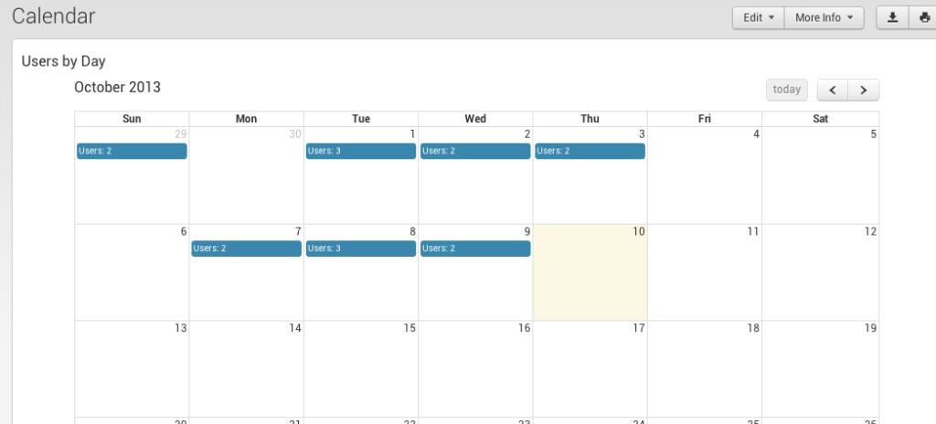
Here is what the calendar looks like in Splunk:
If you want to see how to use this calendar visualization in your own Splunk environment, check out my Splunk blog post.
The cool thing about having this available in Splunk is that it is reusable for various types of data including security, XenDesktop/XenApp, Microsoft Windows, Unix, etc.

